During a recent chat, a prominent ANSI artist mentioned his concerns about the way his ANSI was being displayed in a screenshot I sent him. This lead me down a bit of a rabbit hole of thinking of how people use the CMD.EXE console, first introduced in Windows NT and still with us today, in a bit of mutated form, in Windows 10. To make one exceedingly broad, overarching statement here, it’s important to start by acknowledging that CMD.EXE is absolutely not MS-DOS, so these tweaks are just the tip of the iceberg, especially getting beyond basic aesthetics. Still for those of us who occasionally use the “command prompt” in Windows to run 32 bit console applications (or if you’re using 32 bit Windows, even old 16 bit DOS programs) things just aren’t quite right.
First there’s the font. ANSI artists reading this are probably passingly familiar with the disparity between using a normal 8px wide font vs the old 9px wide VGA font since it’s, if nothing else, right there in the menu of our most popular modern ANSI editing tool, PabloDraw. Even back in the DOS days the 9px wide font was a bizarre thing artists had to work around, or sometimes take advantage of to interesting effect. Suffice to say, most of us have gotten used to drawing and viewing ANSI in the 8px font these days and may even prefer it. So what then, do we make of the bizarrely squashed font we encounter when running CMD.EXE? It can be kind of jarring, that’s for sure. Probably a lot of us would assume that it has something to do with the difference in aspect ratios, which is partially correct, but not for the reasons you might assume. I’ll talk about more in Part 2. The biggest problem is actually that Microsoft defaulted the CMD.EXE font in all versions of Windows up until Windows 10 to a 12px tall font. The original VGA text mode font most of us PC types are familiar with is 16px tall. Yes, that is a big difference!
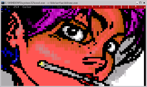
Allow me to demonstrate via Windows XP’s CMD.EXE, looking at an ANSI loaded up in ACIDDraw:

This looks okay, pretty good even, at a glance. If you drew that picture, however? Especially if you might have struggled to get the proportions just right in the first place? It’s terribly, freakishly squashed! Just compare it with how it looks with a 8 x 16px font:

You’re on board, aren’t you? So let’s fix this! When you go to the properties of a running CMD.EXE you’ll see a handy tab labeled “Font”. Therein is a list of TrueType fonts which, when clicked, allows you to pick a font size. There’s also a “Raster Fonts” section which when clicked will show you a number of bitmap font options listed by pixel sizes, including the default we’re currently using, 8 x 12. So, easy to solve right? We just change to the size we want, or maybe pick a better TrueType font and… err. I’m sure almost everyone reading this had made it this far on their own at some point in the distant past, only to discover that there isn’t any better looking raster font and the TrueType font list is missing almost all of the fonts you have installed on your system. How helpful. It’s at this point most of us would give up and resign to a life of living with these new, weird proportions.
It doesn’t have to be so! I won’t re-write the book as how to add “custom fonts” to your CMD console since it’s well documented all over the Internet. Google if you need more help than I give you here. In short, there are two basic ways to do this:
- Install one or more 8 x 16 raster fonts. These will automatically appear in the CMD.EXE raster font list (only listed by their pixel size) after being re-launched.
- Install one or more properly proportioned TrueType fonts. Unfortunately this method also involves having to go to “HKEY_LOCAL_MACHINE\SOFTWARE\Microsoft\Windows NT\CurrentVersion\Console\TrueTypeFont” in your registry and adding a new string value representing the name of the new font. Still, after that one tiny change, it should appear in your CMD.EXE’s font list after relaunching it.
Using a raster font is easier, but the advantage of using a TrueType font is that you can then use the “font size” to scale the font (well, the whole window) to a larger size.
Some of the more astute readers might have noticed that the proportions still wouldn’t be exactly correct, since 8 x 16 has a slightly different aspect ratio than 9 x 16. Again, Part 2 is going to be all about aspect ratios. Still, the short response to that concern is that you can actually install a 9 x 16px font the same way we installed the 8 x 16px font above if you really want to re-live the old days or are just a stickler for accuracy.

Of course, there’s the matter of which fonts to actually use. There are a number of good monospaced fonts that look pretty appropriate (or at least, pretty cool) and some even include the high ASCII characters needed for displaying ANSI art fairly accurately. Personally, I’m using the ones included in The Ultimate Oldschool PC Font Pack. This includes fonts from a number of old PC BIOSes lovingly converted to CP437 raster and TrueType fonts. The ones you probably want to install being “IBM VGA8” and “IBM VGA9”. Check out the awesome documentation for the font pack over here for a lot more technical details on the included fonts and some of the topics discussed here.
Definitely an improvement, right? Right. So now your text mode programs all have the right font and the right proportions! Err, not so fast!
—
1. tk-disto.ans by The Knight and Filth from Fuel #12 (1997)